固定宽高div中图片按照最长边自适应
 六月初
六月初在固定宽高的一个div模块中嵌套一张图片,使图片的最长边自适应占满div块。效果如图:
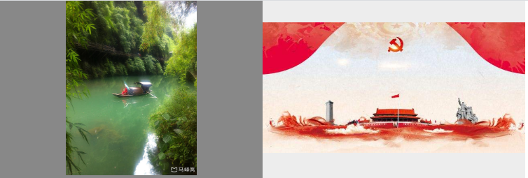
从图中可以看出在固定宽高的div中,最长边总能100%占满div模块,使整个图片能完整的显示在div中。
那么关于该效果如何实现的呢?
代码块如下:
<!DOCTYPE html>
<html>
	<head>
		<meta charset="utf-8">
		<title></title>
	</head>
	<body>
		<style>
			* {
				padding: 0;
				margin: 0;
			}
			.box {
				width: 600px;
				height: 200px;
				display: block;
				margin-left: auto;
				margin-right: auto;
			}
			.box .box_child {
				width: 300px;
				height: 200px;
				display: table-cell;
				vertical-align: middle;
				text-align: center;
				background: #EDEDED;
			}
			.box .box_child img {
				width: auto;
				height: auto;
				max-width: 100%;
				max-height: 100%;
			}
		</style>
		<div class="box" style="position: relative;">
			<div class="box_child" style="background: #888;">
				<img src="https://ss0.bdstatic.com/70cFvHSh_Q1YnxGkpoWK1HF6hhy/it/u=2308493547,1738423737&fm=15&gp=0.jpg">
			</div>
			<div class="box_child">
				<img src="https://timgsa.baidu.com/timg?image&quality=80&size=b9999_10000&sec=1593933696288&di=867392cf5c23dd8ddb1f335272fa79da&imgtype=0&src=http%3A%2F%2Fhbimg.b0.upaiyun.com%2Feaf8fd11b3f48a5aa2d00c020f4097495964487611059-KDnoQn_fw658">
			</div>
		</div>
	</body>
</html>
以上效果便是图片最长边100%占满div,使整个图片完整显示在div中。
 六月初字帖坊小程序
你想要的字帖模板及工具,这里都有!
六月初字帖坊小程序
你想要的字帖模板及工具,这里都有!
811篇文章
2407人已阅读